

Forward booking: Overview
Product:
Hotel booking app - Forward Booking, focusing specifically on the search, select, and checkout process.
Target consumers:
Users who want to book a hotel efficiently.
Problem statement:
The hotel booking application needs a smooth user experience. In order to create a successful app, we first need to implement a full process of understanding what the user's pain points are and address them through intentional design.
My role:
Conduct multiple research methods to define, analyze, and address the issue in my design.
Tools used:
Figma, InDesign, Illustrator, Photoshop, Procreate, Zoom, and SurveyMonkey.
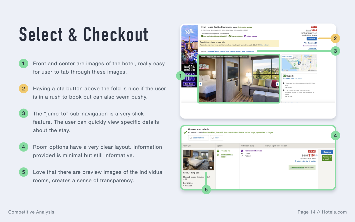
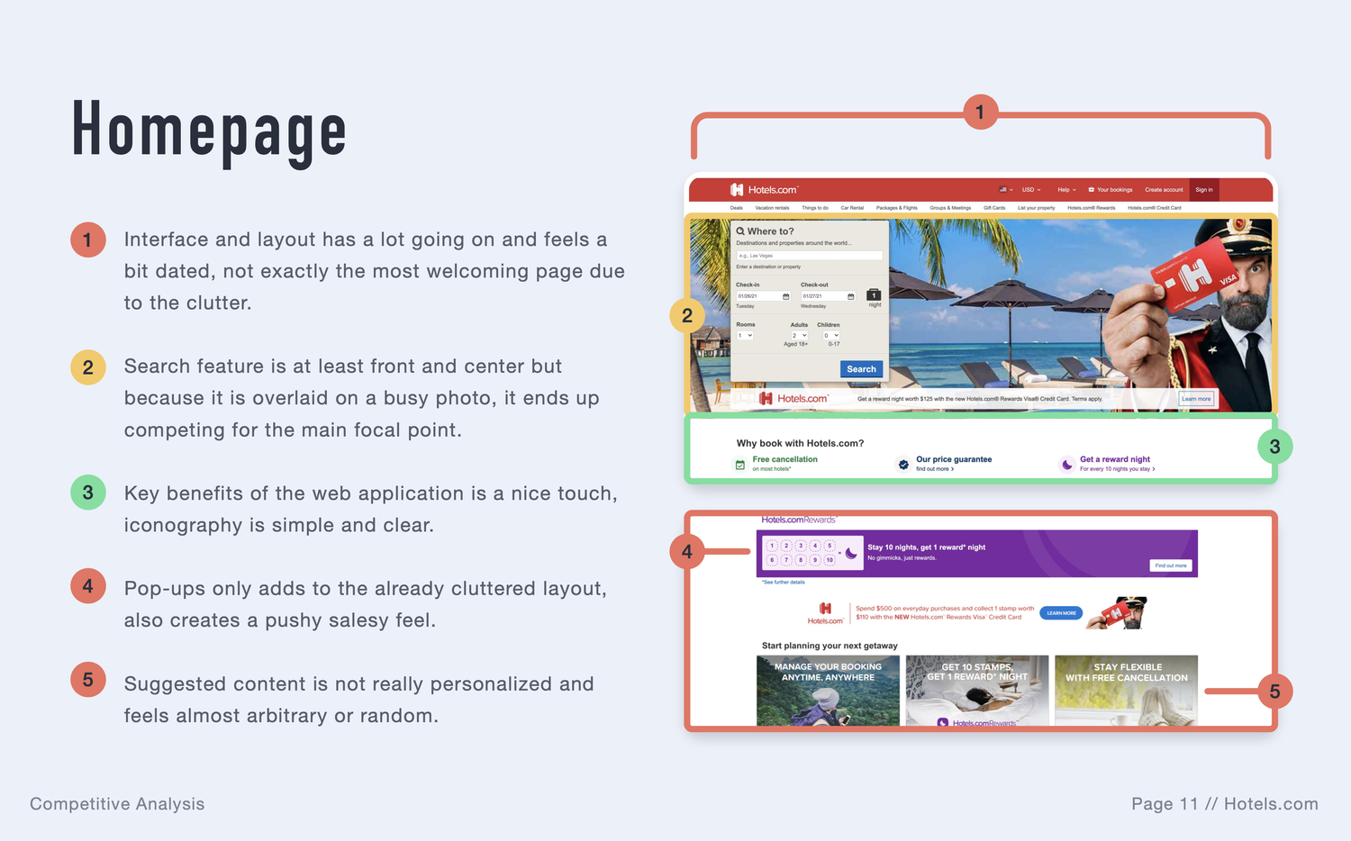
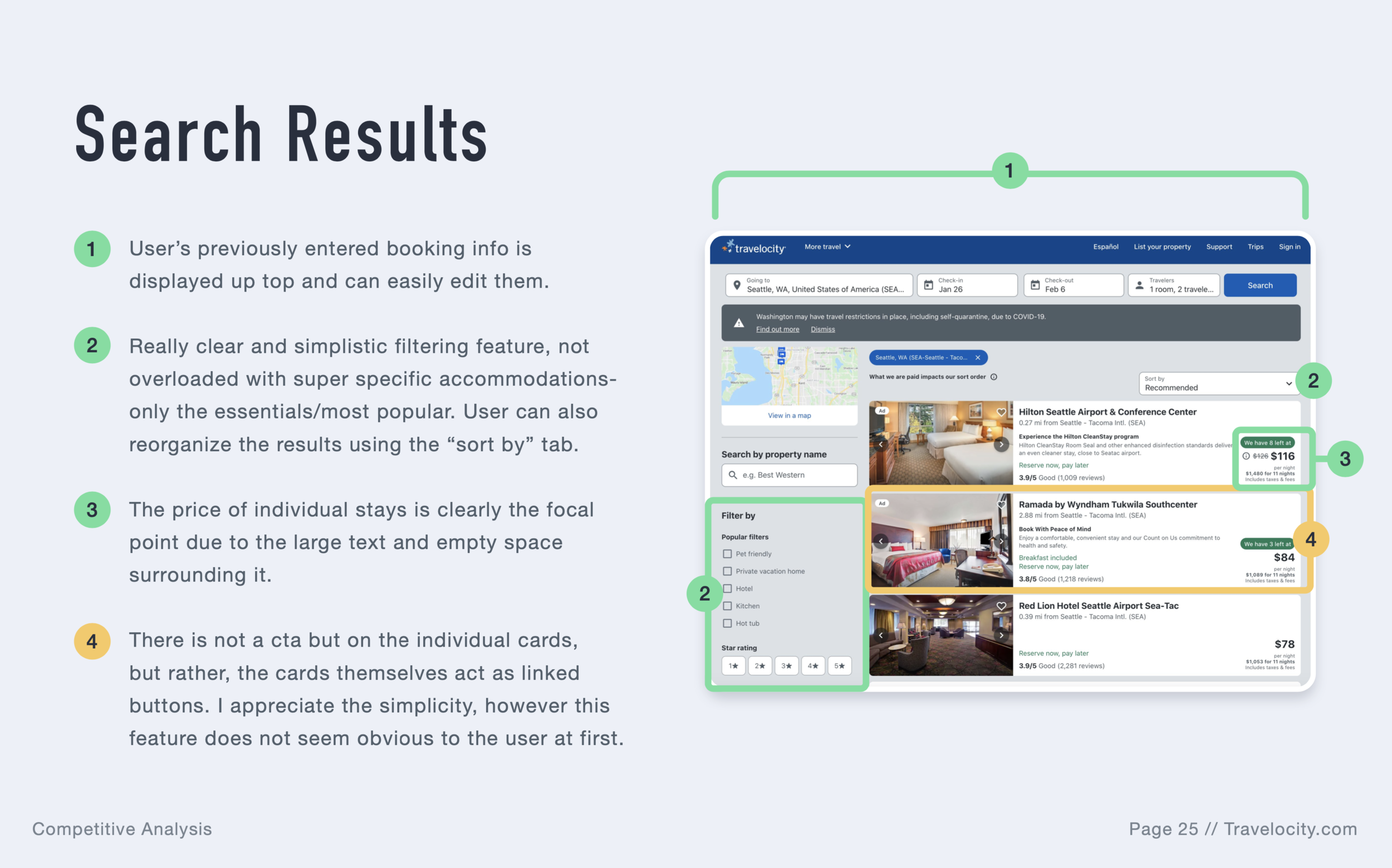
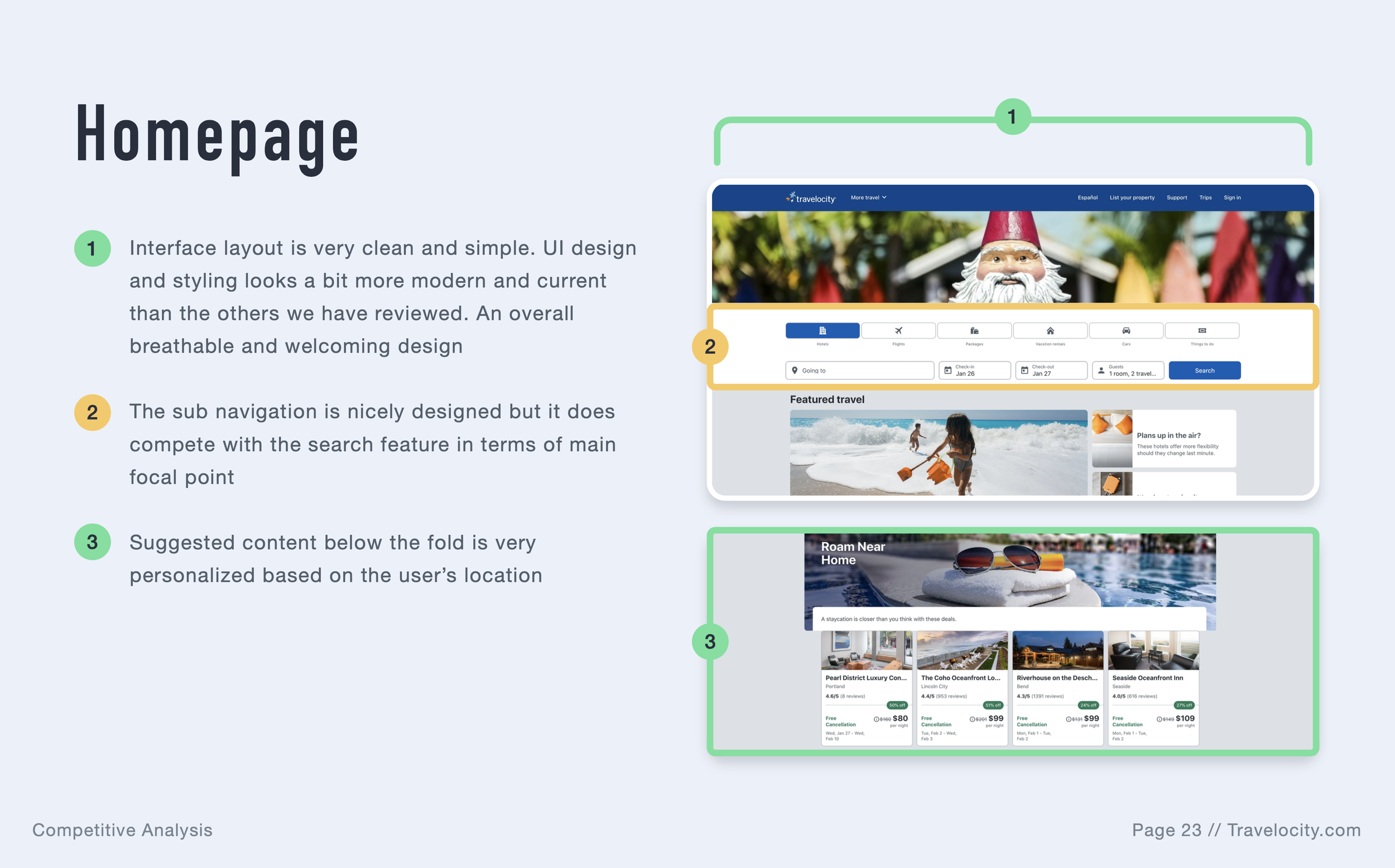
Competitive benchmarking
The intention:
Learn how other apps are addressing the problems I was trying to solve for this specific case study. I reviewed applications such as Booking.com, Travelocity, Trivago, and Hotels.com.
Discover patterns that work and find areas for improvement– or to be avoided altogether.
Highlight the best practices.
Have a practical insight into the functionality of the products.
Findings:
Interaction designs need to be simple, yet effective, ridding of any clunky user experiences. Information should be organized logically and intuitively. Smart layout design, when paired with convenient features, will go a long way, preventing the user from feeling overwhelmed.
Surveys
The intention:
Recruit 15 to 20 volunteers to fill out the survey.
Help to gather data to create more informed design decisions later.
Learn more about the goals of the consumer: What they are trying to do? Is there anything that prevents them from completing the task? How is their experience with the apps they have been using?
Findings:
Most people go on a hotel booking app to make a reservation for an already pre-planned trip.
Folks often struggle with interactive features: using the filter feature, selecting add-ons, and getting through the room selection process.
Some folks have pointed out that certain booking applications look too cluttered and confusing.
Usability testing
The intention:
Recruit three volunteers and conduct two usability tests on two different sites with each volunteer, resulting in a total of 6 tests.
Learn who the users are, and what are their goals and behaviors.
Record the sessions and take diligent notes.
Findings:
Users often felt overwhelmed by the sheer amount of information on the tested applications.
People were confused with the general flow of screens.
There was a trend of users wanting to be able to confirm desired amenities, hotel policies, and prices early on in the consumer journey.
Users dislike excess scrolling.
Users want to see many high-quality photos of the hotels, as well as room details.
Confirming add-on’s and room details was not intuitive.
Users were not able to easily verify desired amenities or filter results.
At times, navigating to the interactive map was fussy.
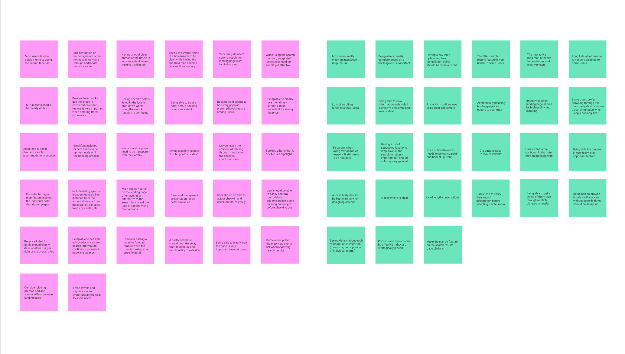
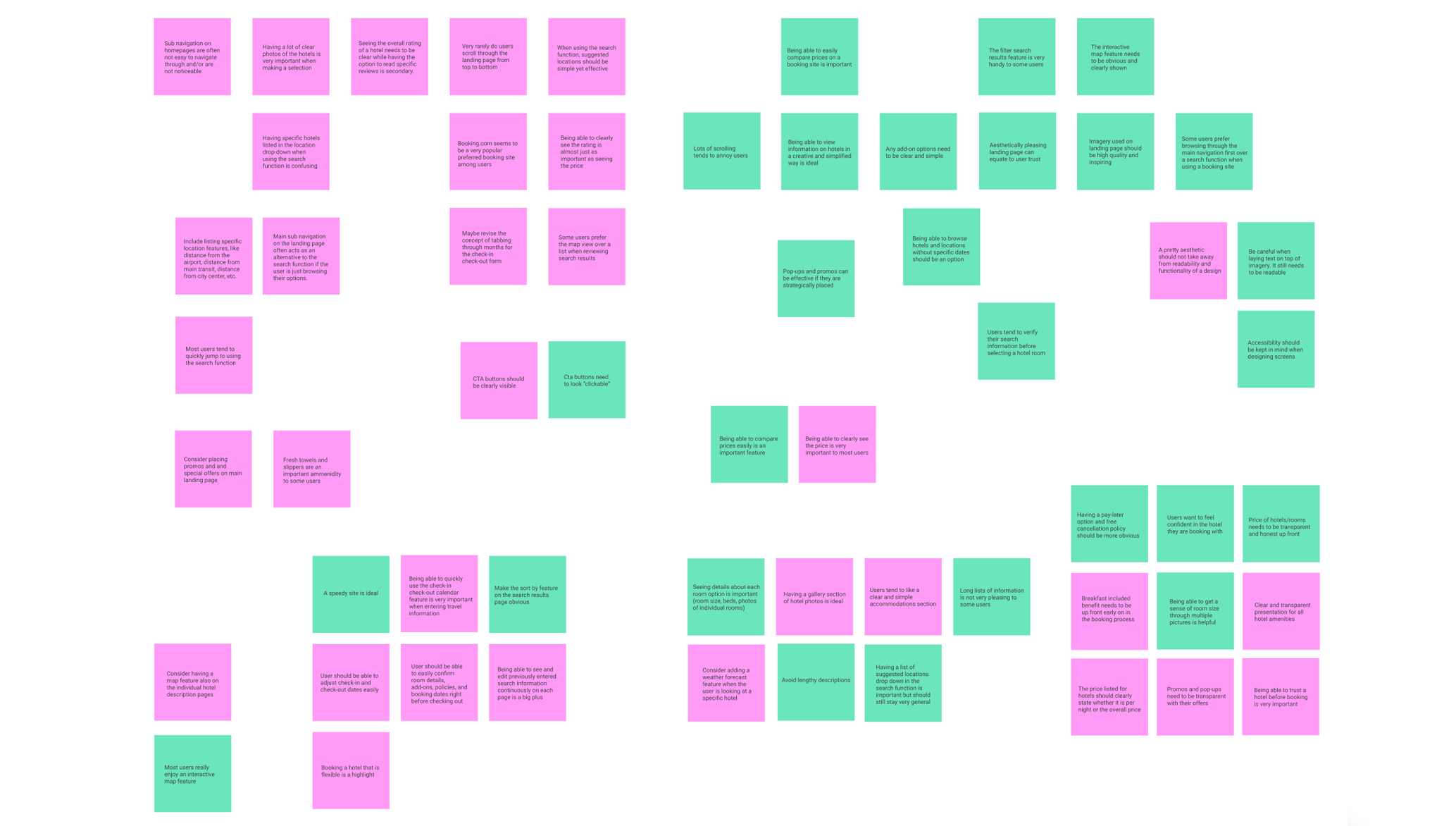
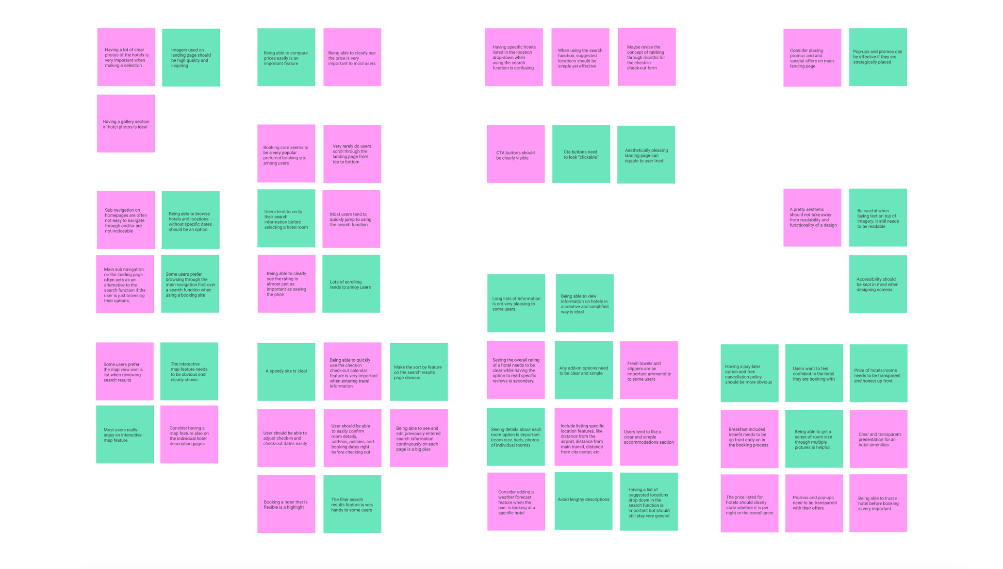
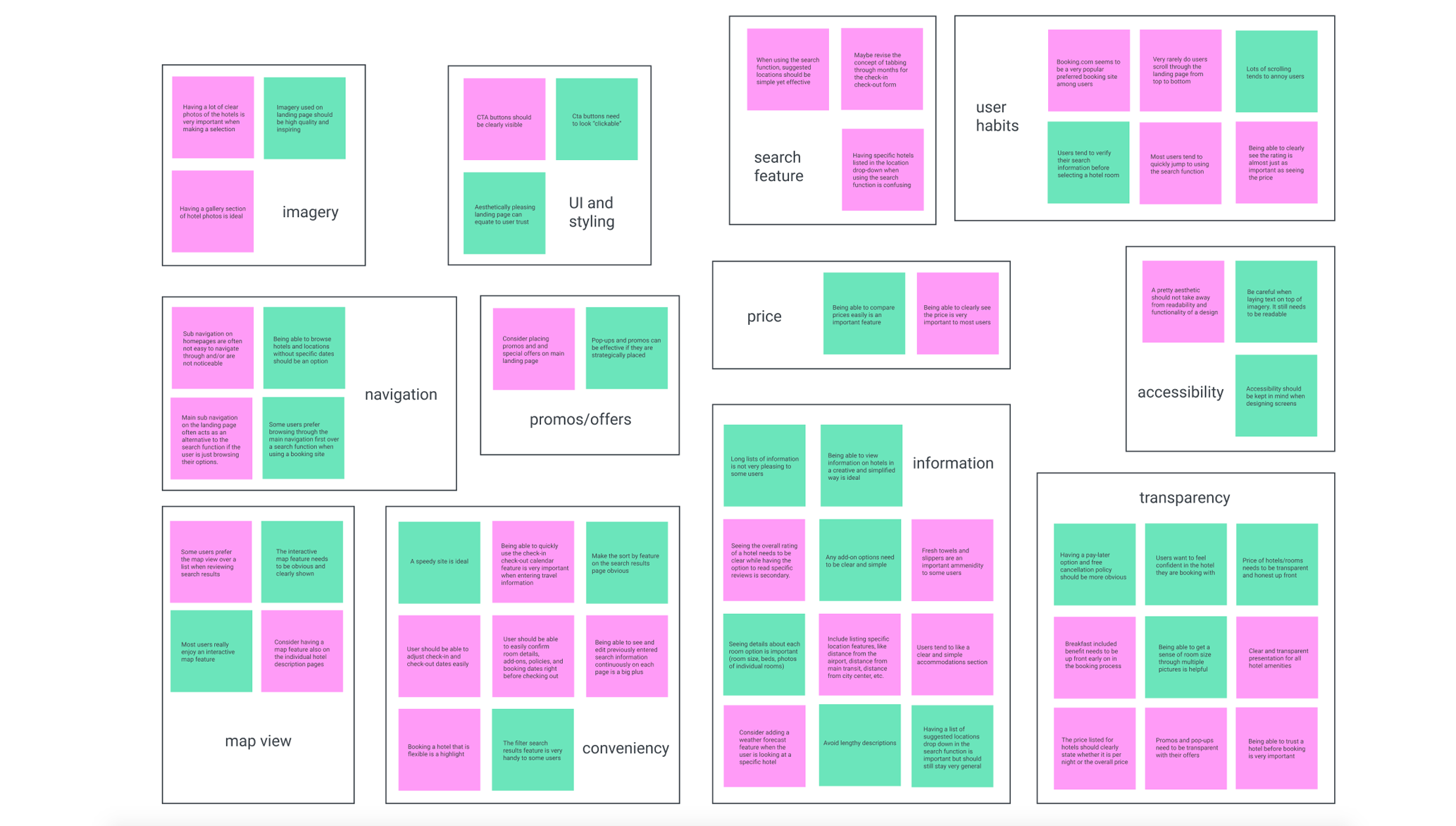
Affinity diagram
The intention:
After conducting an online survey and reviewing multiple user interviews, the next step is to analyze this collected data. The most credible way to break down qualitative data is to create an affinity diagram to identify any trends and, in the future, make informed design decisions. The following are screenshots of an in-progress affinity diagram that was created through virtual collaboration with a colleague.
Findings:
There was a handful of trends: imagery, navigation, UI/styling, search, user habits, promos, price, accessibility, map view, conveniency, information, and transparency. The most prominent trend was how information was displayed, while brand integrity/transparency and conveniency came second. Moving forward when making design decisions, we will need to focus on showing critical information about listings, without overwhelming the user. (Seems like quite the task!)
Customer journey map
The intention:
The organized data from the affinity diagram is useful to build out a customer journey map. From mapping out all the users' high-level steps when booking a hotel, I withdrew many conclusions, later addressed in my design concepts.
How:
At each stage of the booking process, I divided the general user experience into different categories: goals, context, behaviors, positive reactions, and pain points. I also included direct quotes for more contextual detail.
I used emojis to indicate which parts of the user journey were mostly positive, neutral, and mostly negative experiences.
The final part of this task was drawing the curve, and weighing up the most common type of user experience (positive, neutral, negative).
Customer journey mapping is a crucial tool for my design. This way I could clearly see what worked and what didn't at each stage of the booking process. This tool also helped me to define the problems and empathize with the users

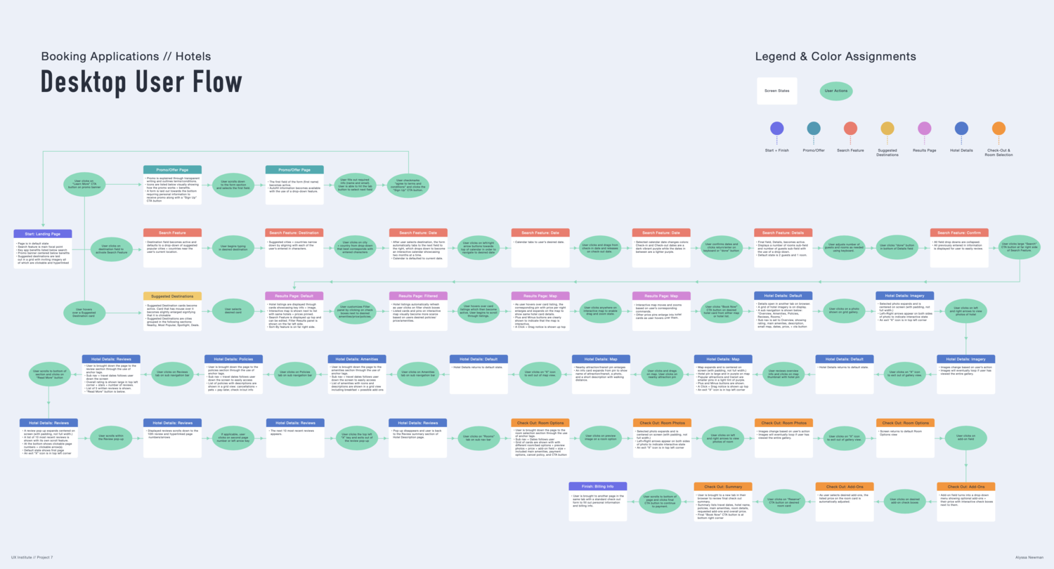
User flows
The intention:
After analyzing all the collected data, it was time to start mapping out the design from a high level. By creating a user flow diagram, I was able to determine how each screen would work together based on the user’s actions. It is important to note that this user flow shows the ideal path; the number of different actions a user can take is endless. However, for this case study, we decided to focus on the more common flows.
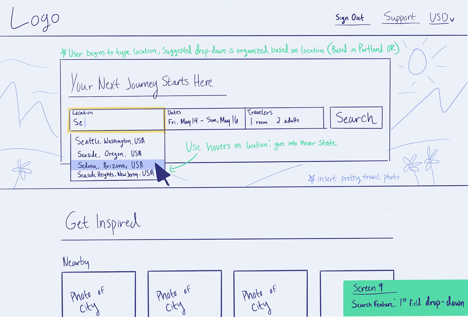
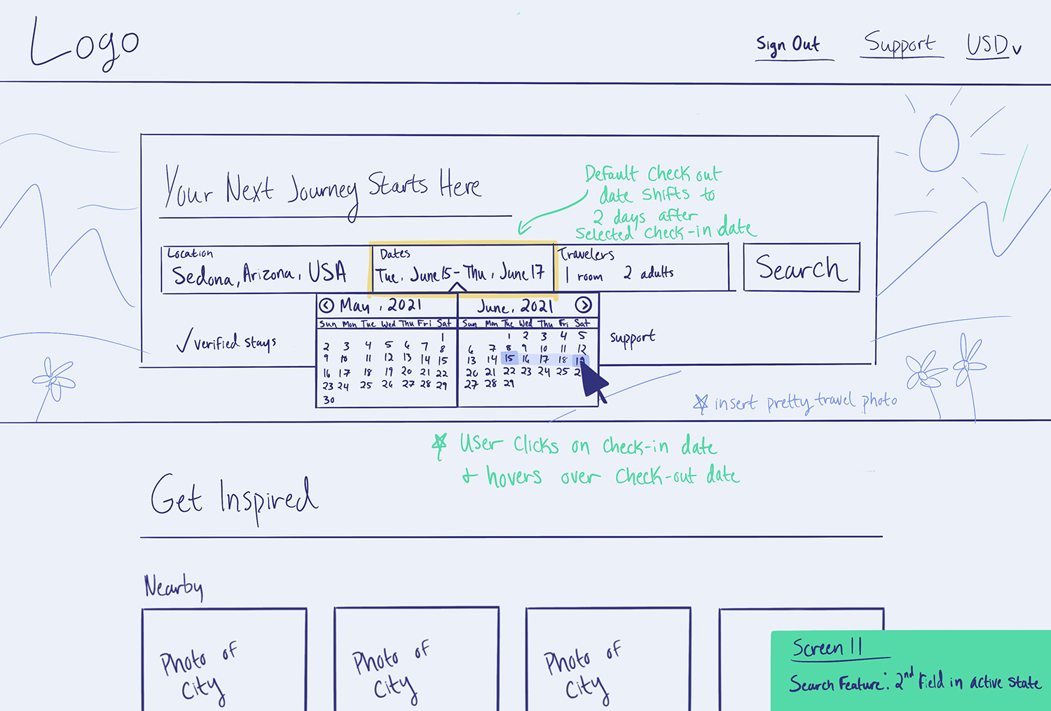
Sketching
The intention:
Drawing low-fidelity sketches by hand is an efficient way of brainstorming the final screen designs. This allowed me to focus only on the general layout and function of each screen and how they will bring solutions to noted pain points from the analysis stage.
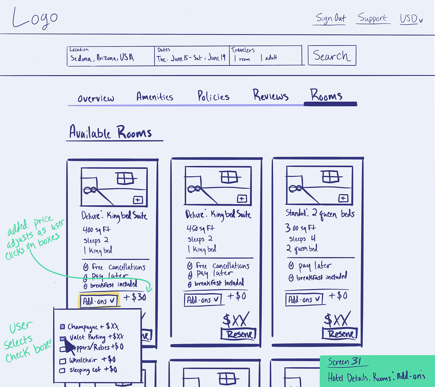
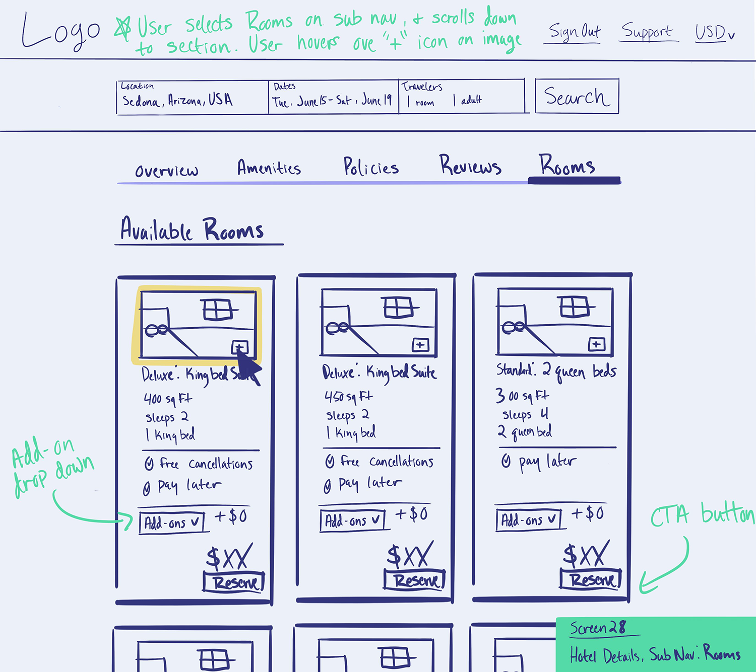
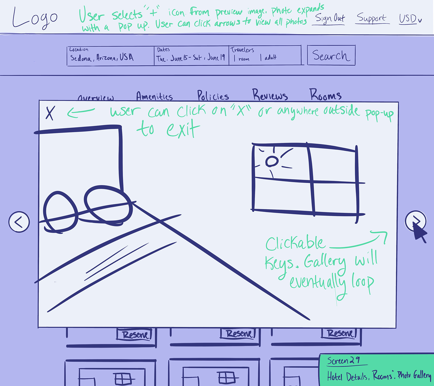
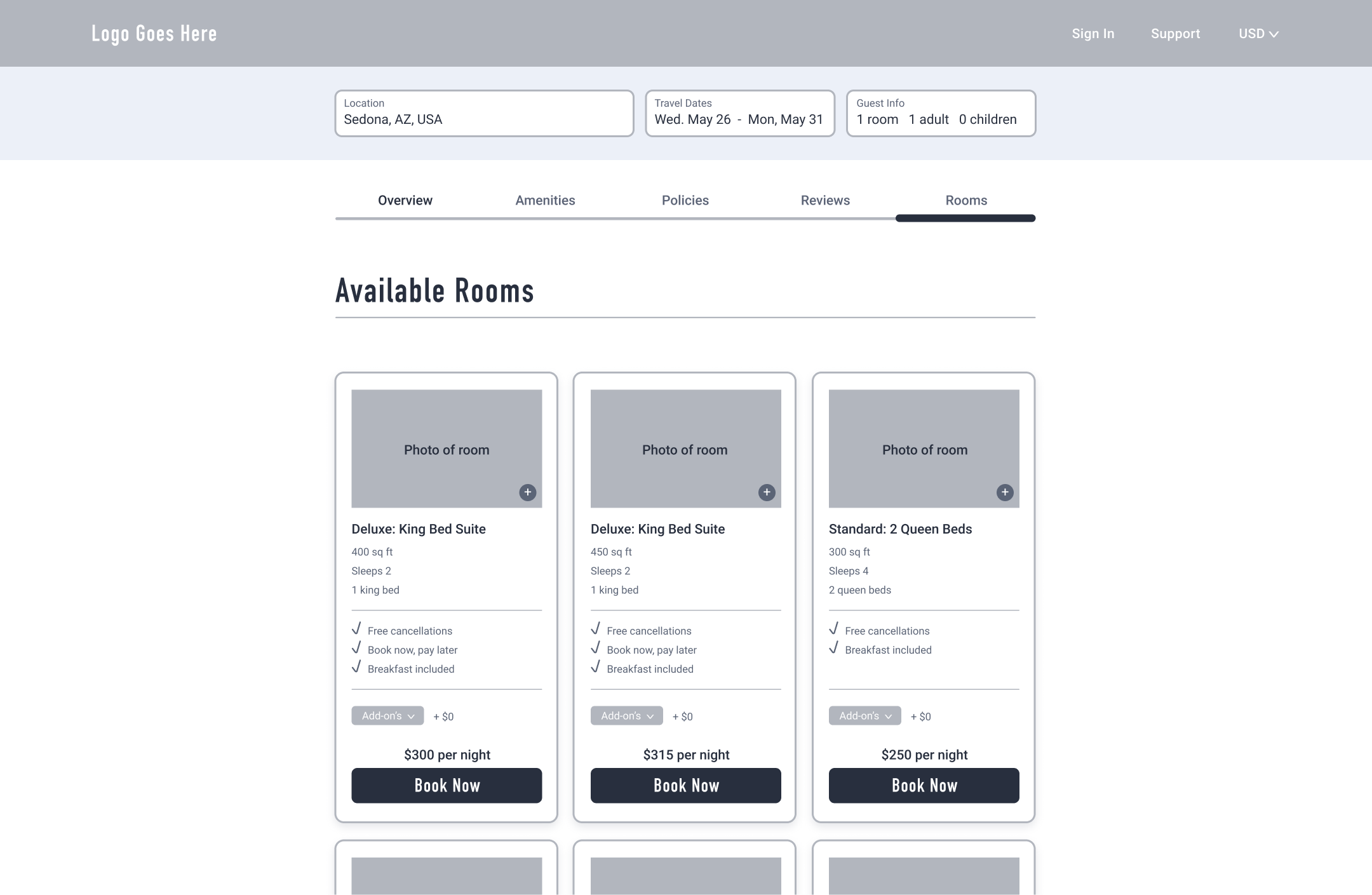
Medium-fidelity prototype
The intention:
After sketching out my general concepts, I entered the next design stage which would involve building out medium-fidelity screens and showing basic interactions through InVision. During this stage, I avoided any attention to UI or specific styling– so that I could focus on making sure the layout and flow were logical and seamless.
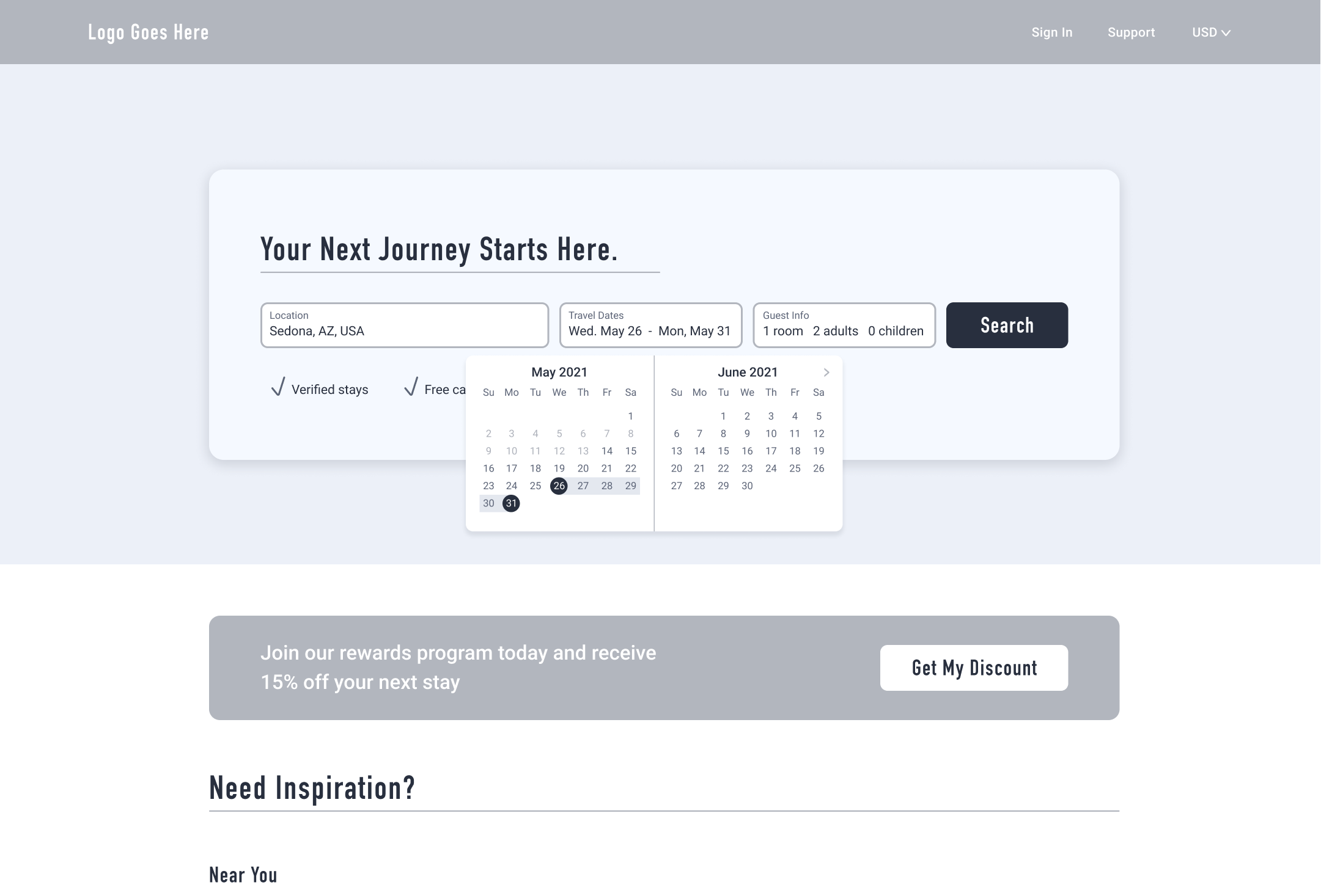
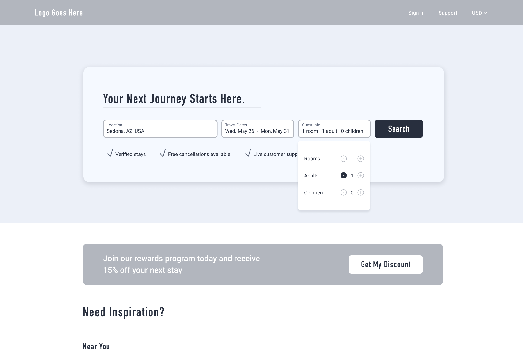
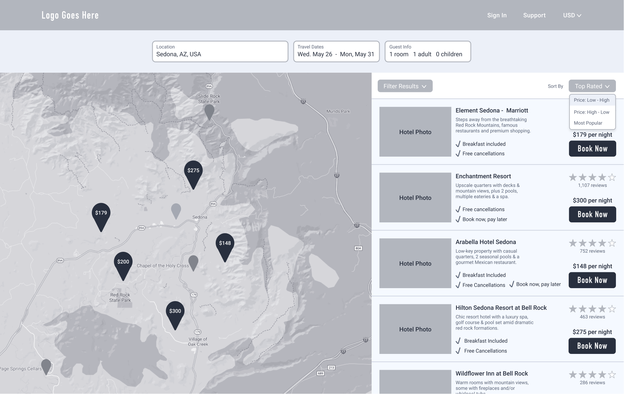
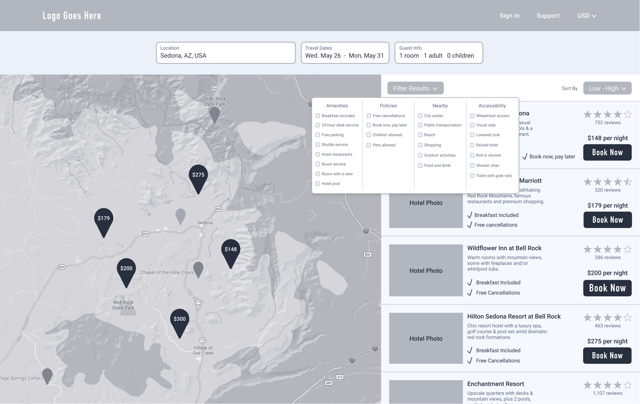
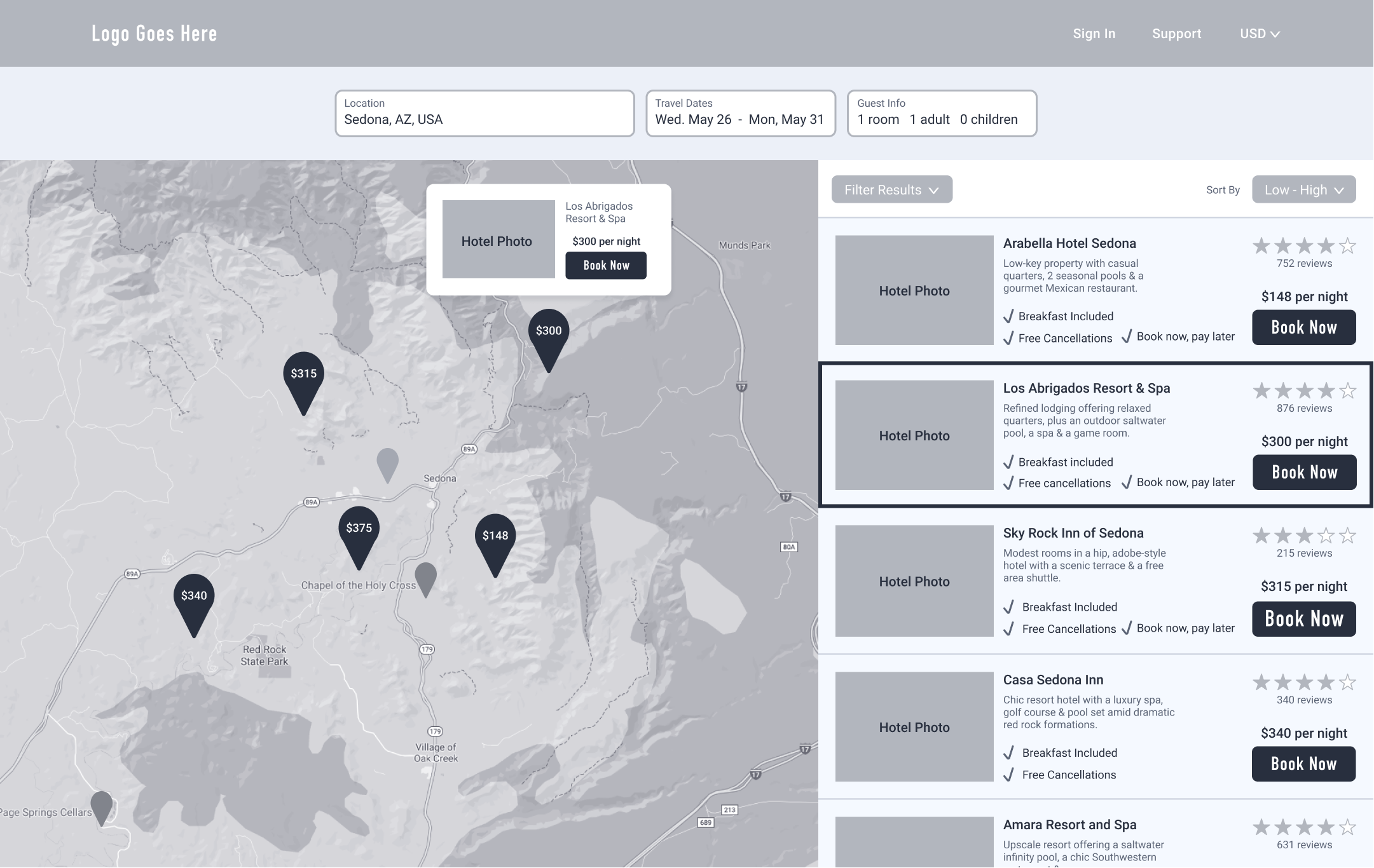
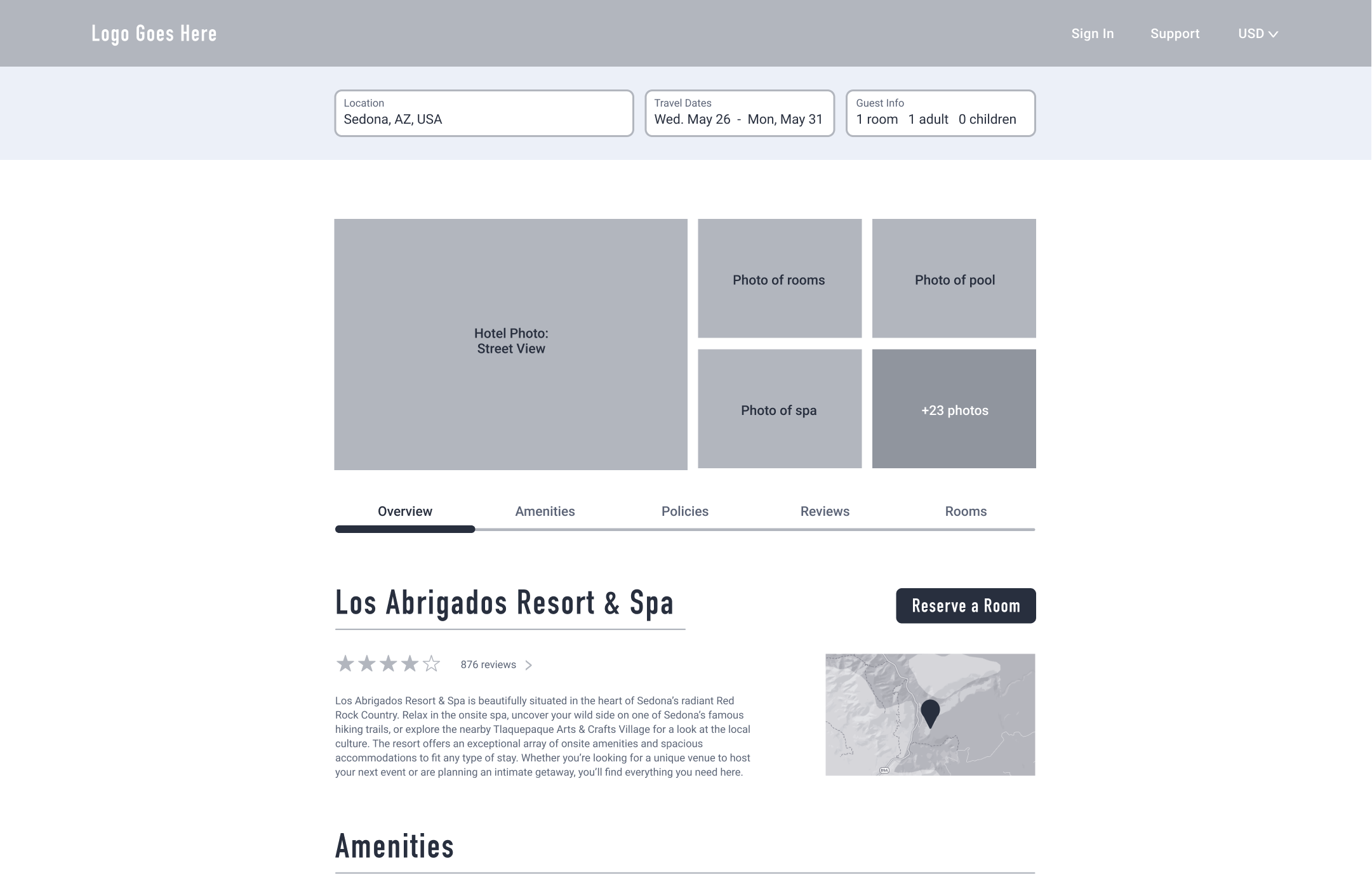
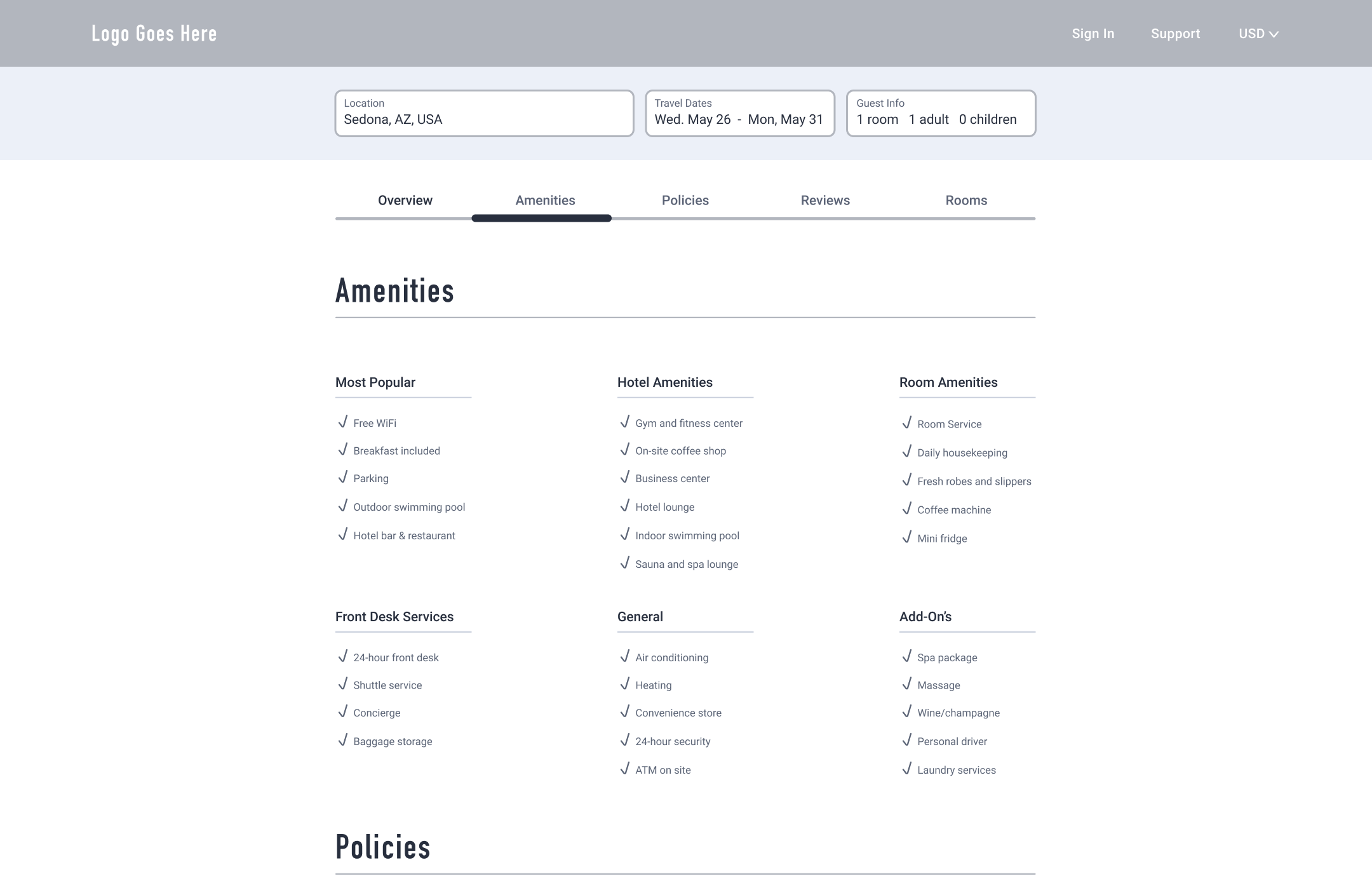
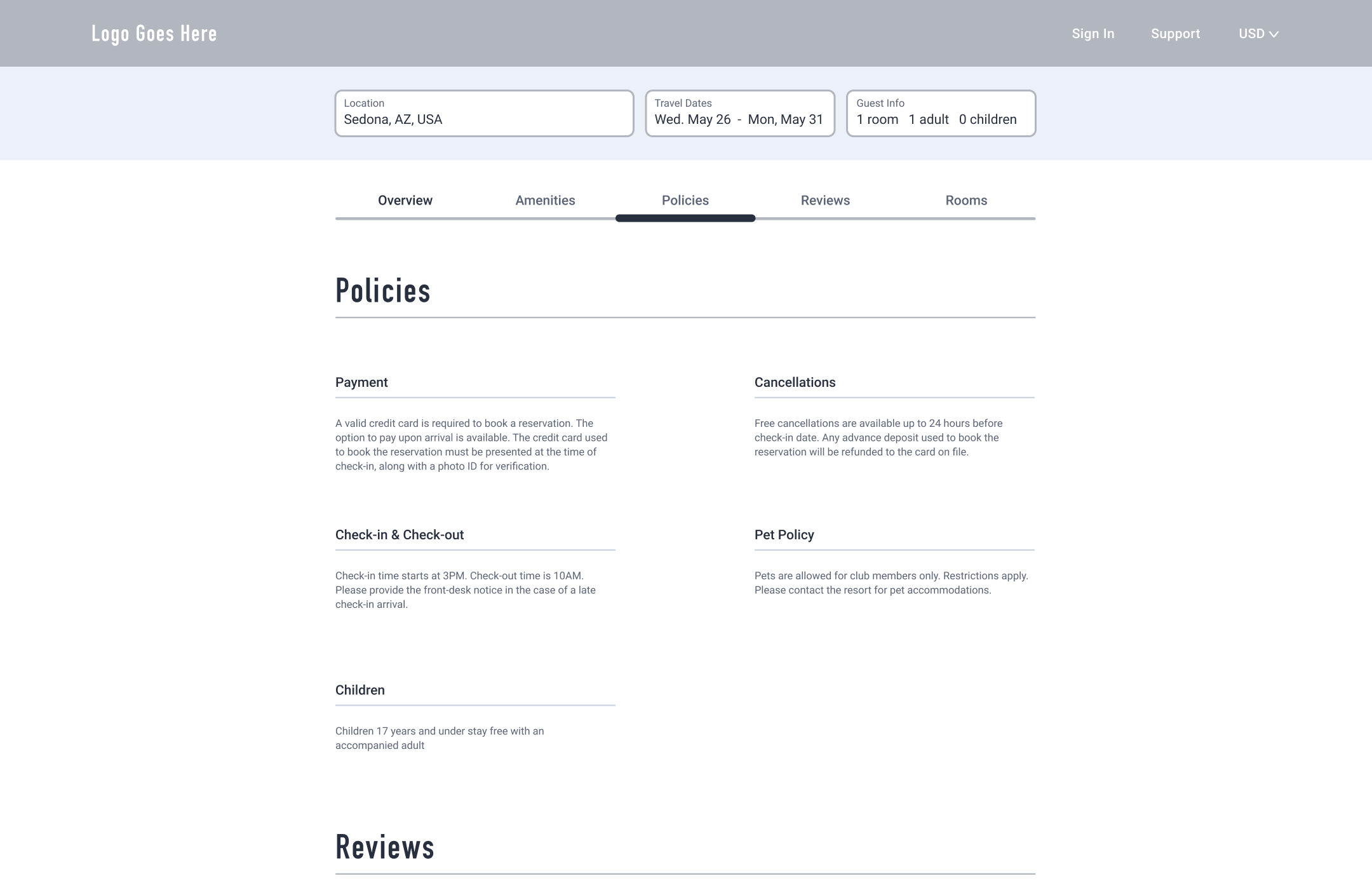
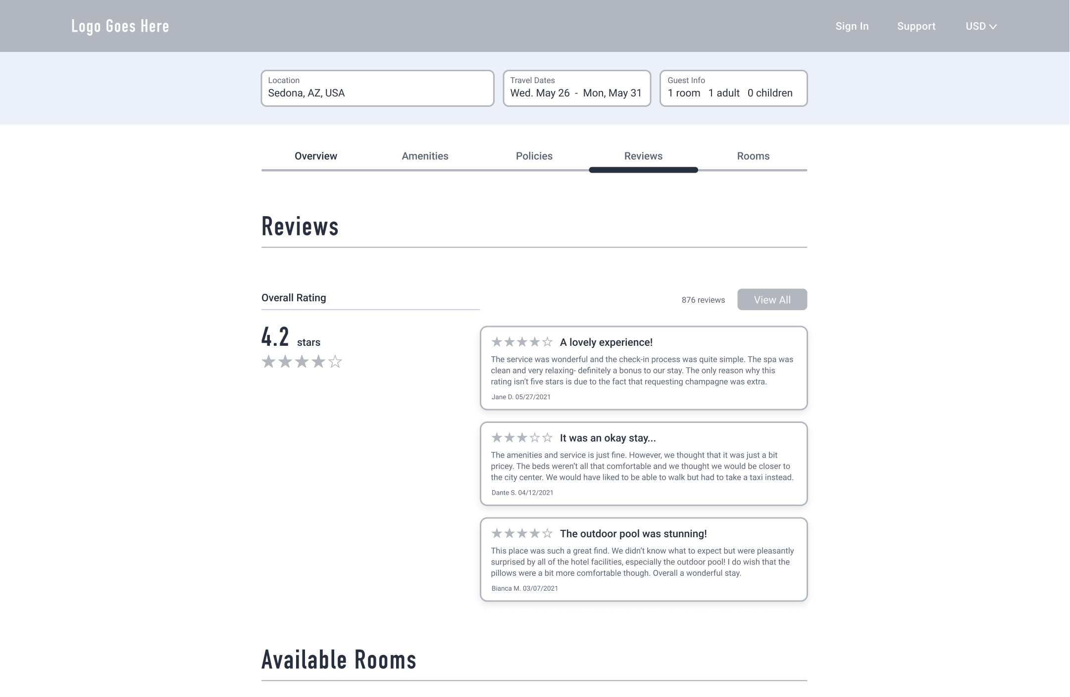
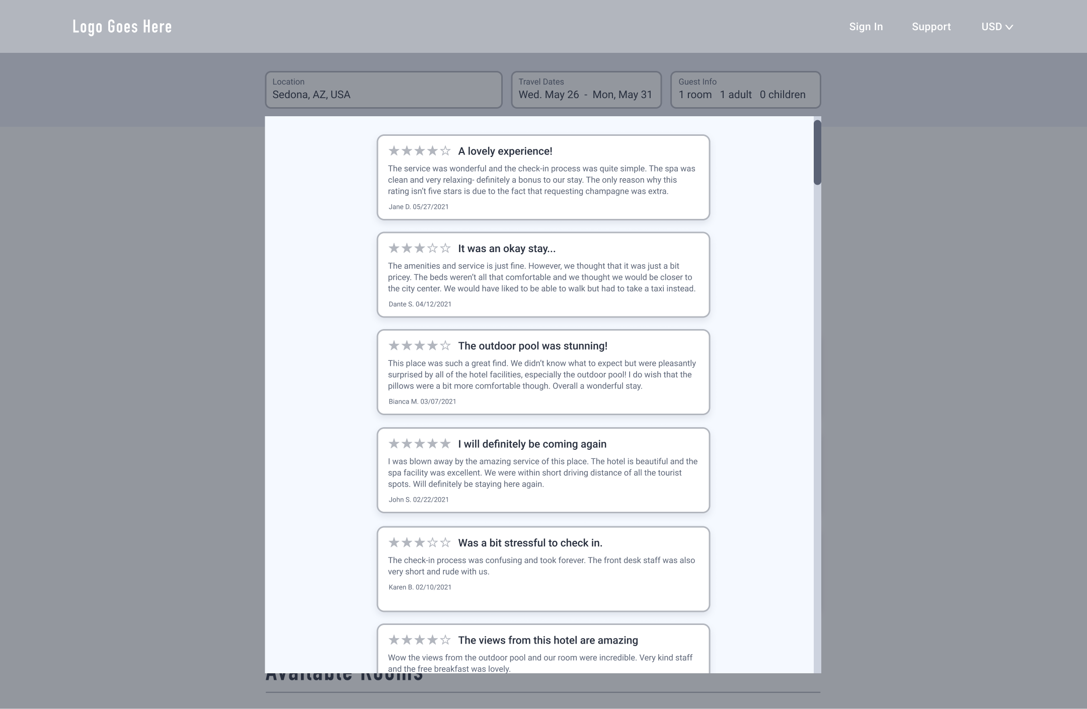
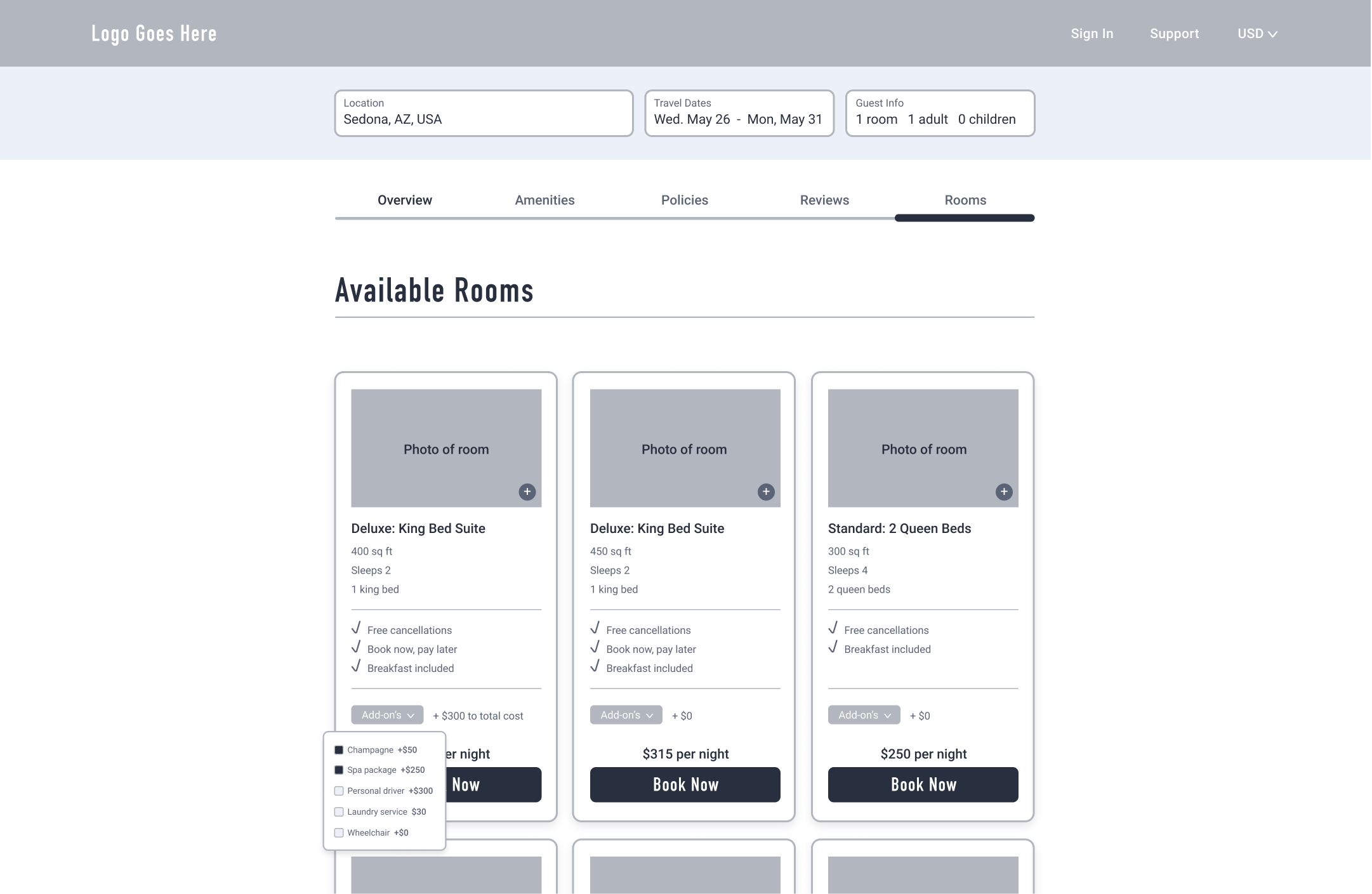
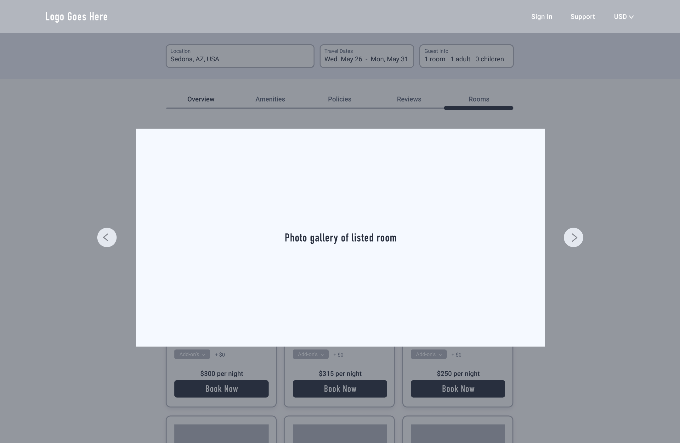
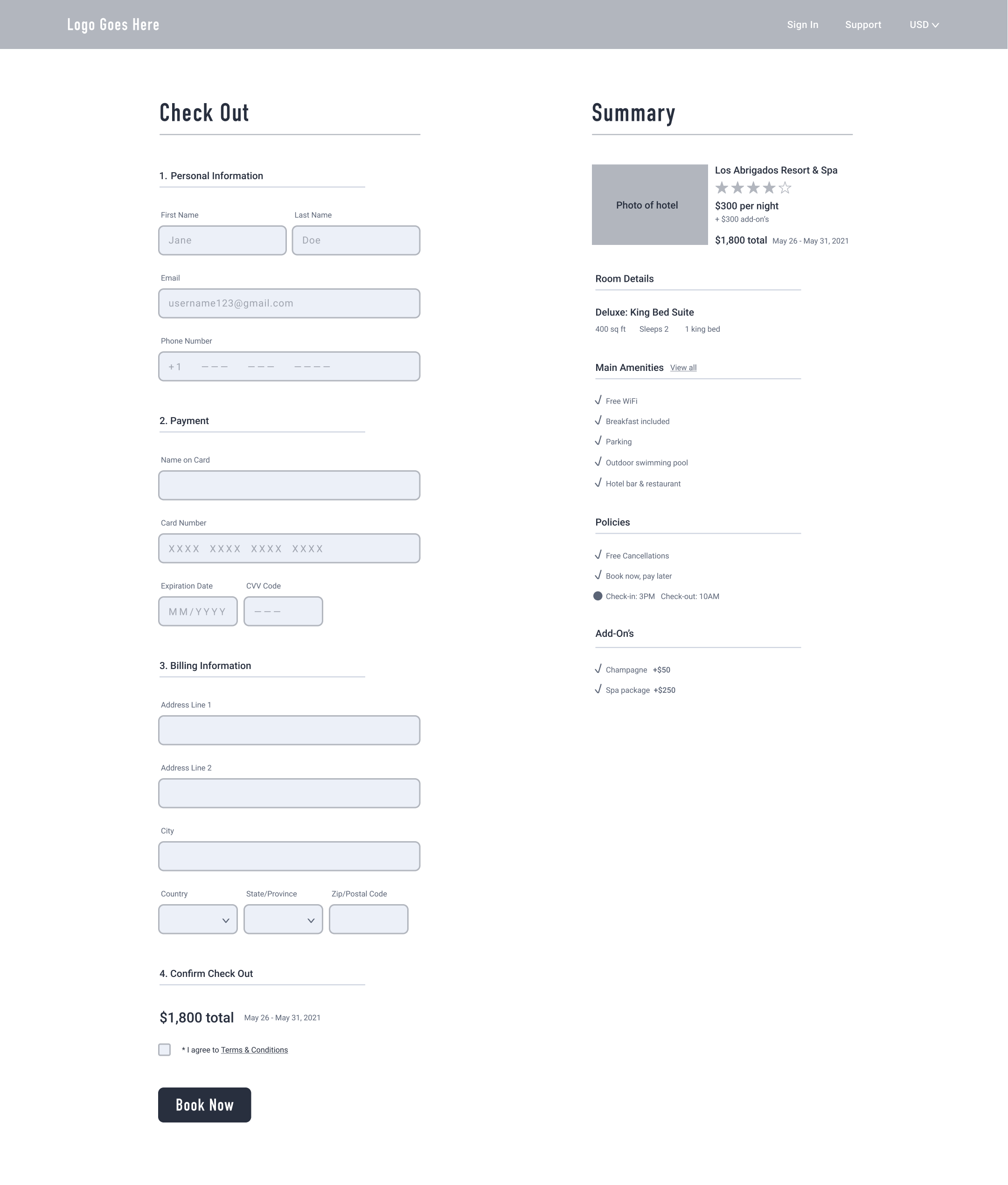
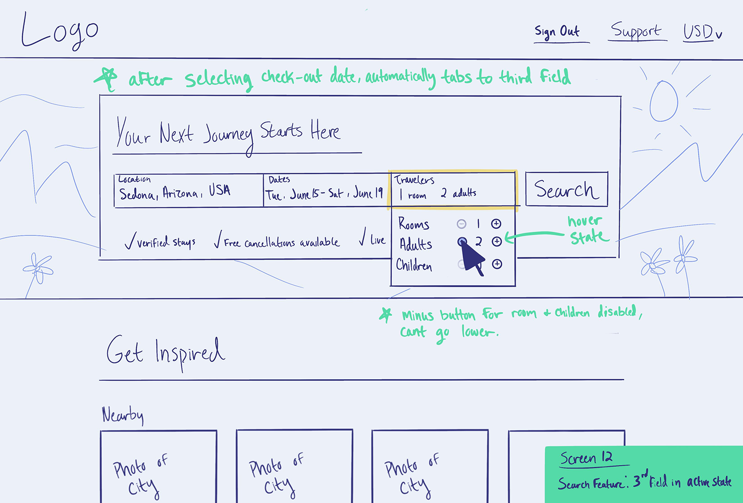
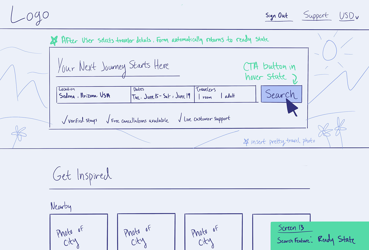
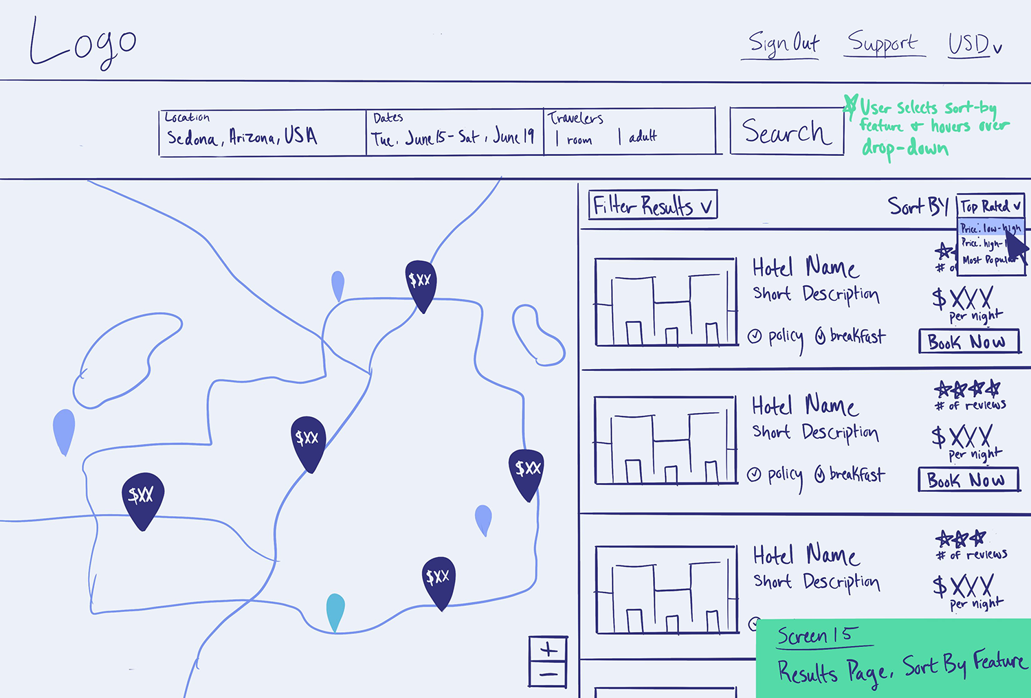
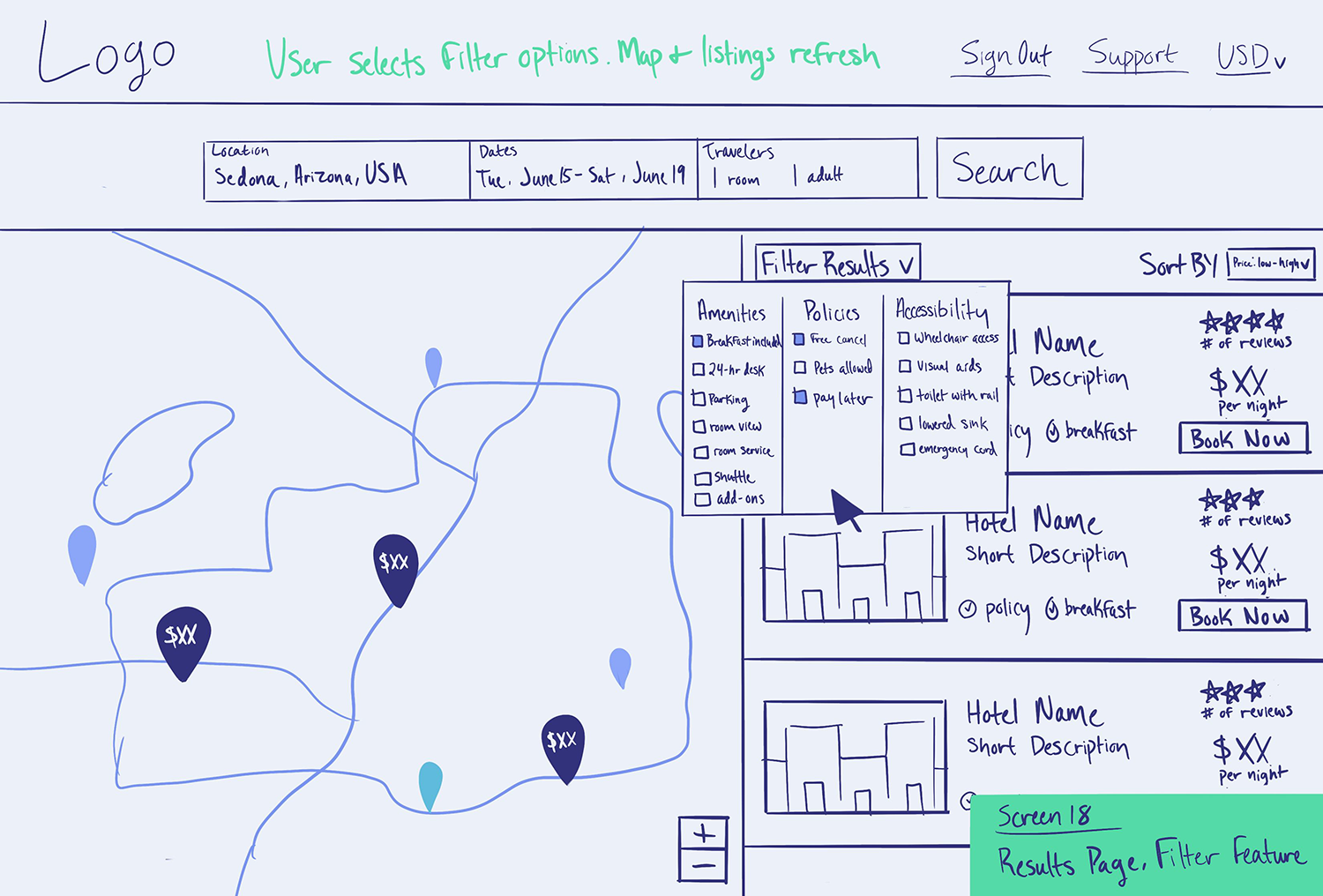
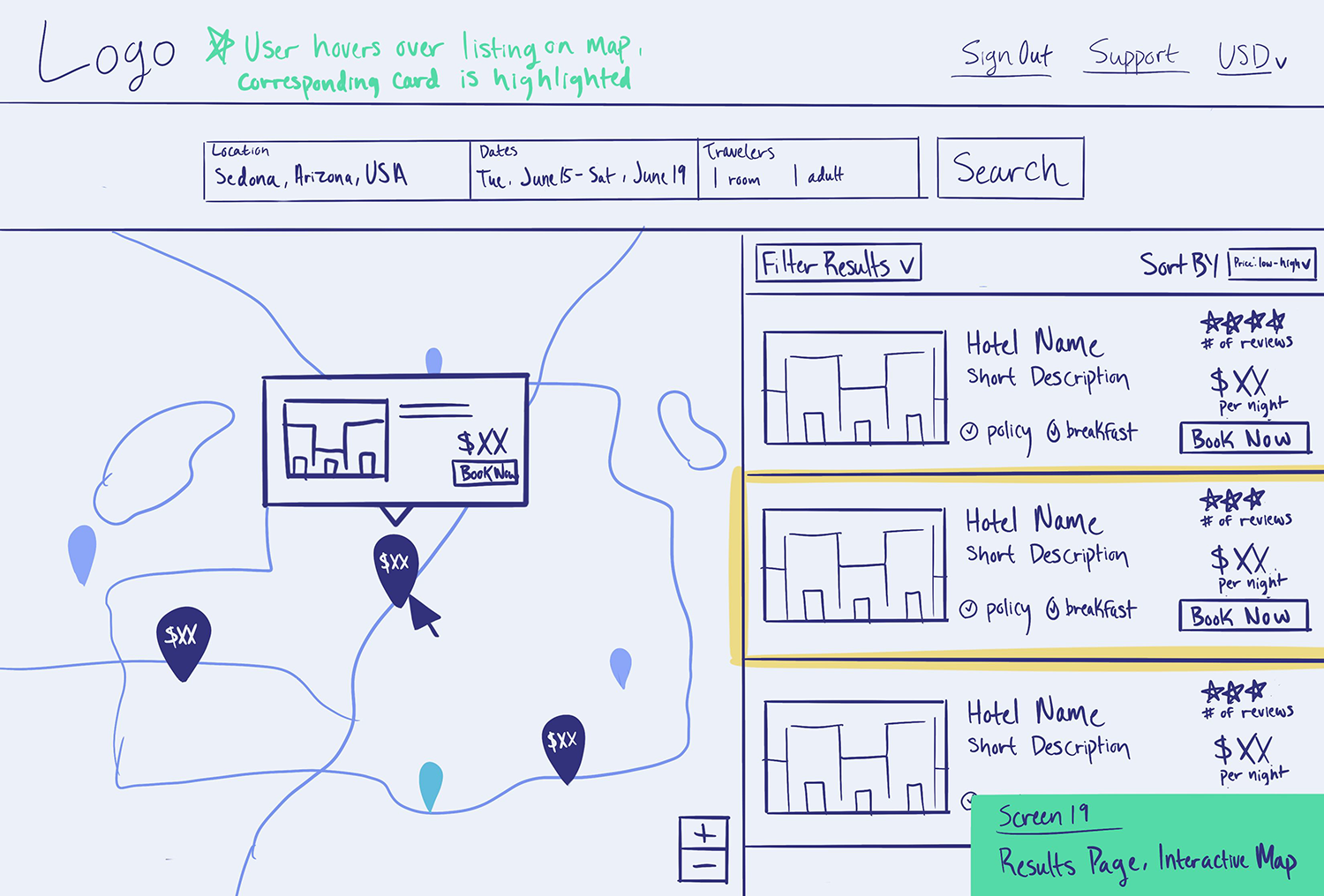
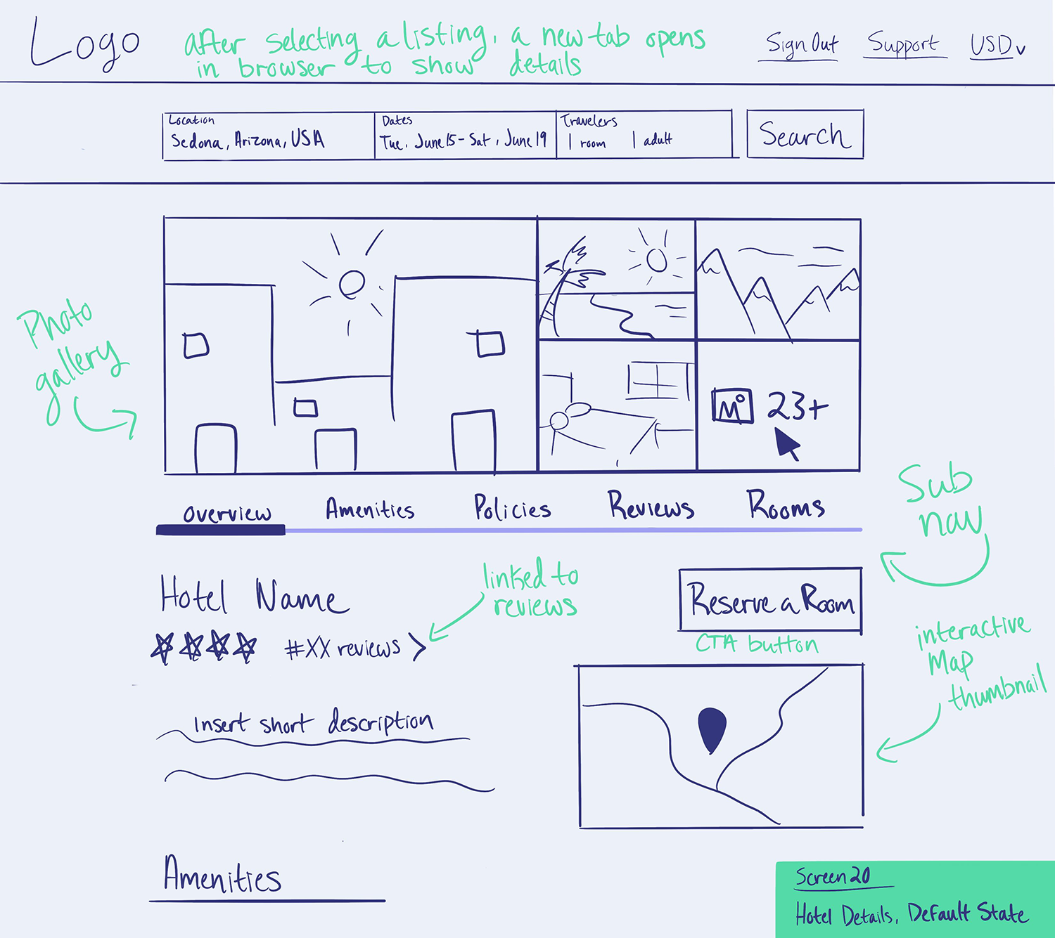
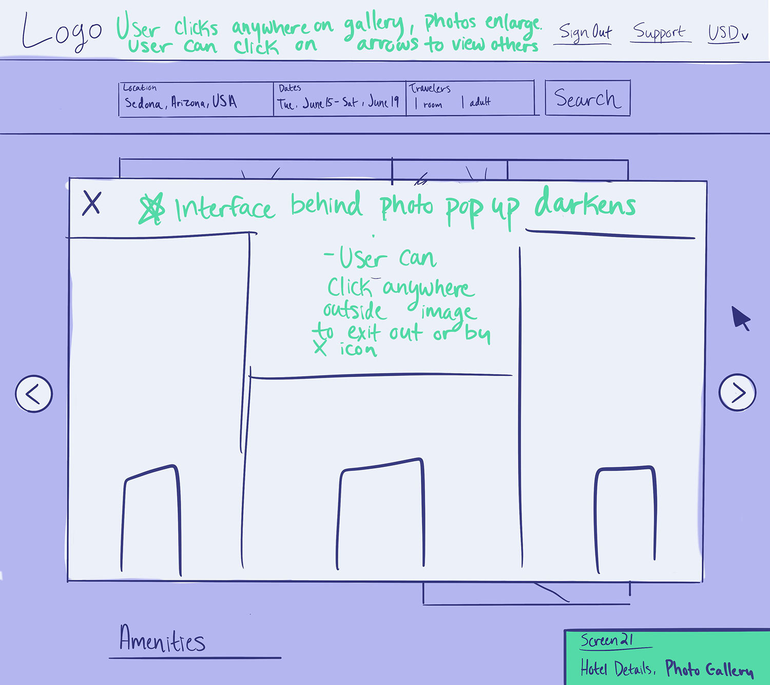
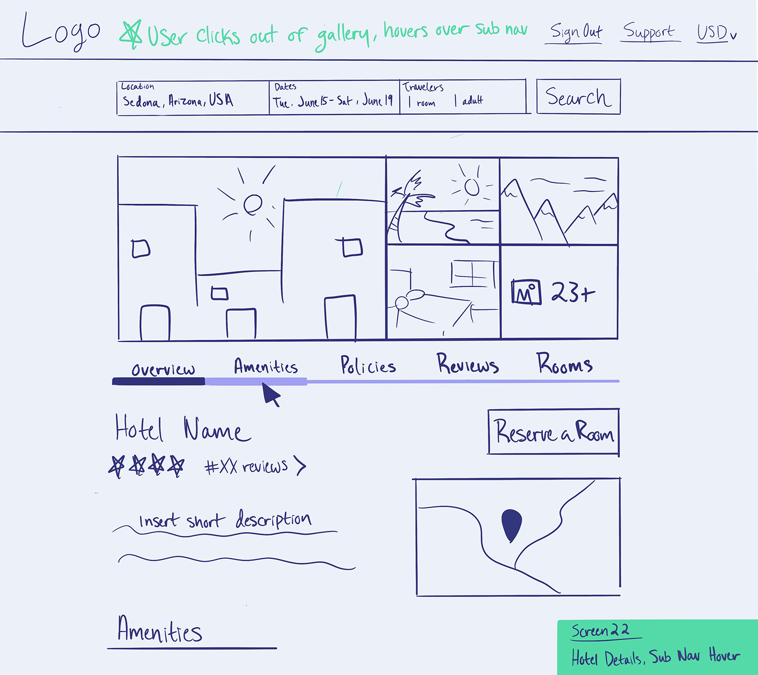
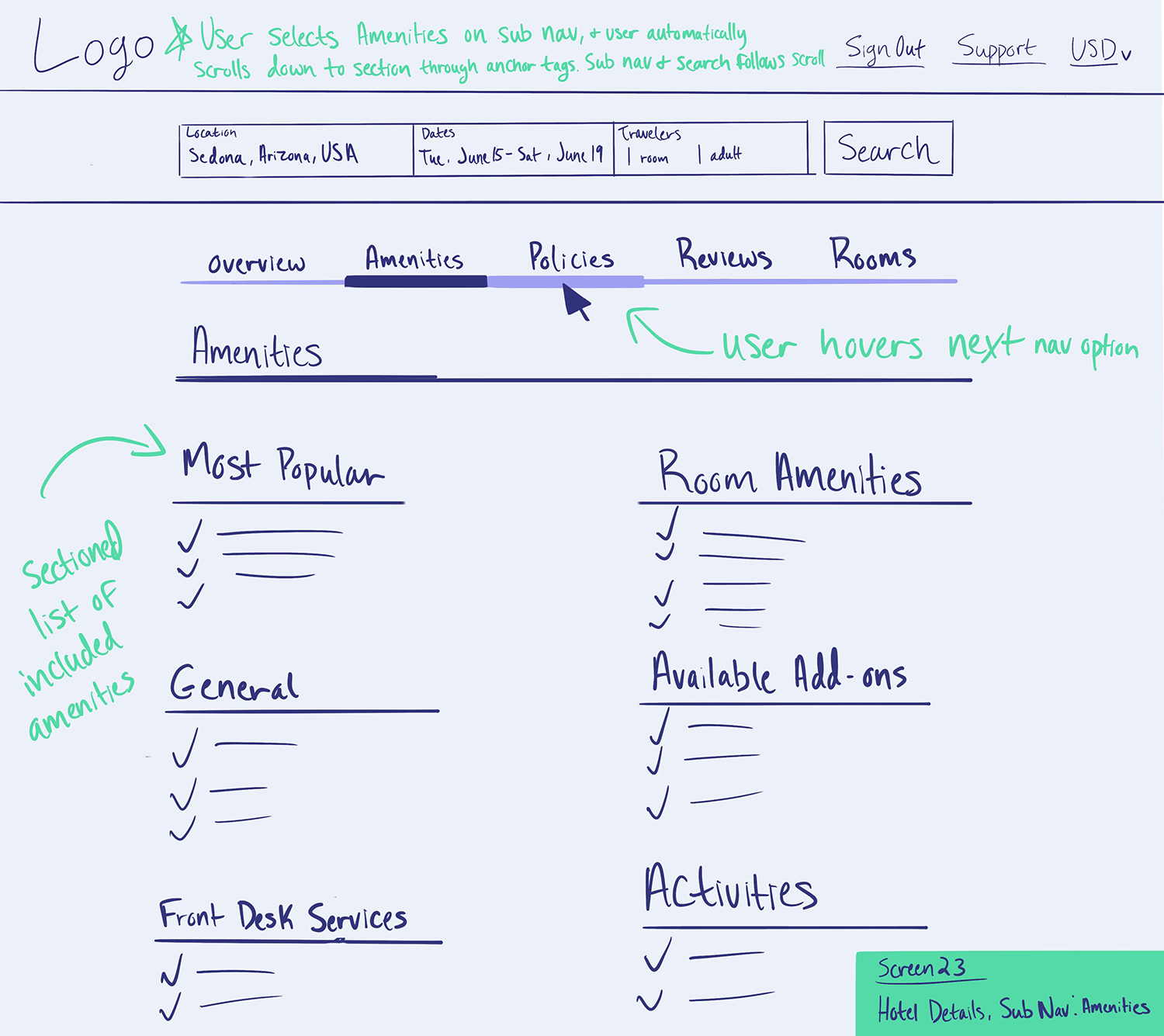
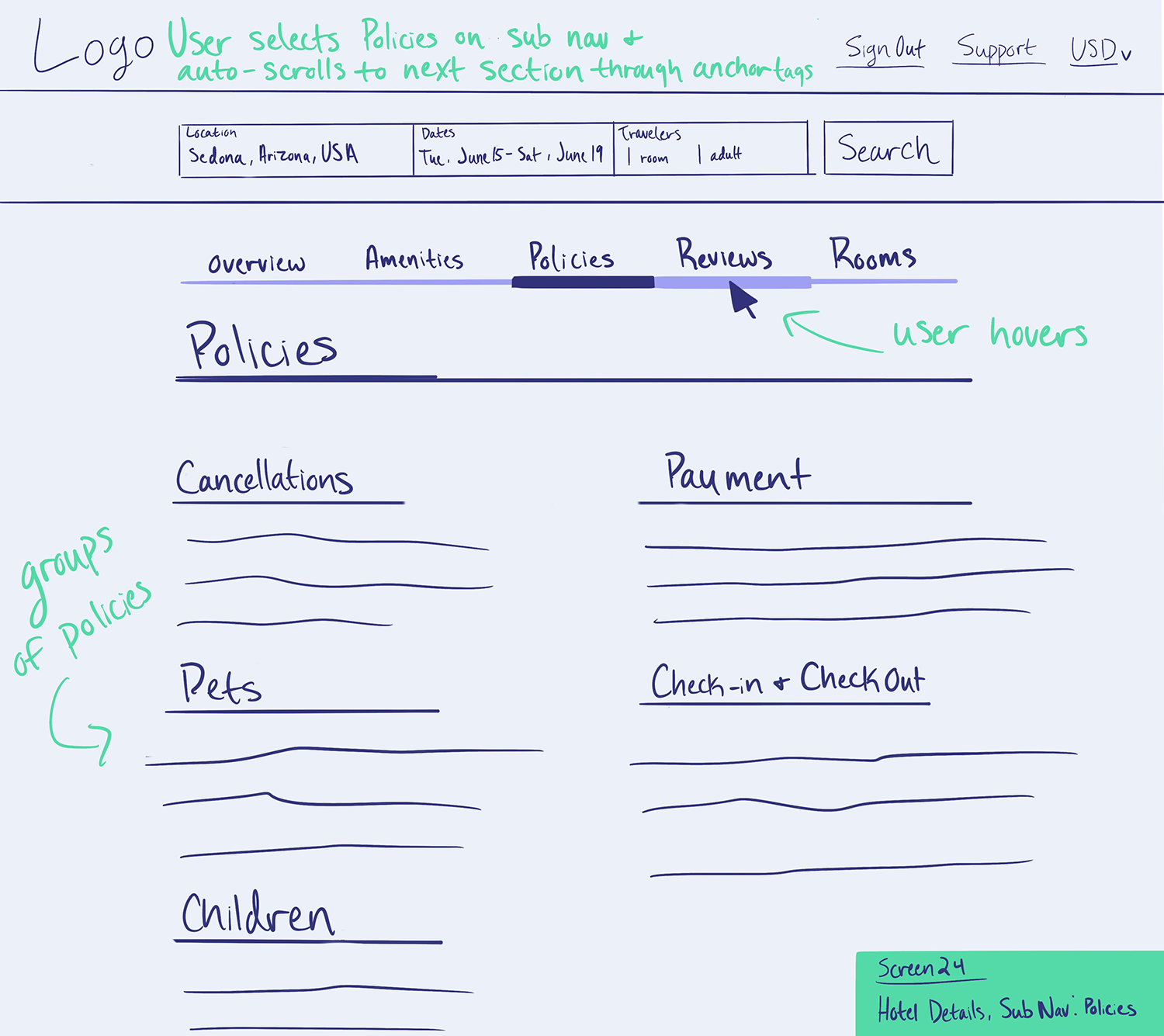
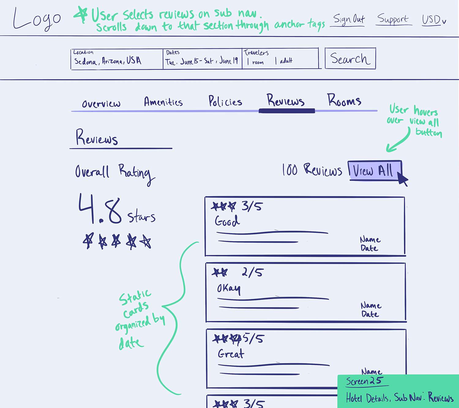
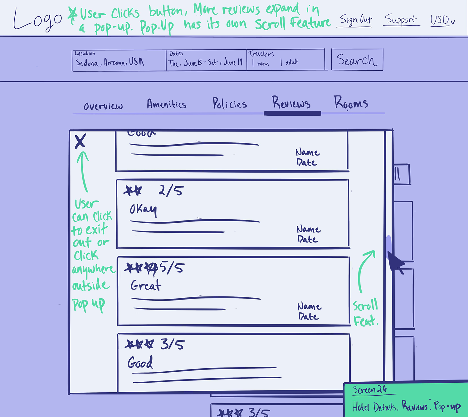
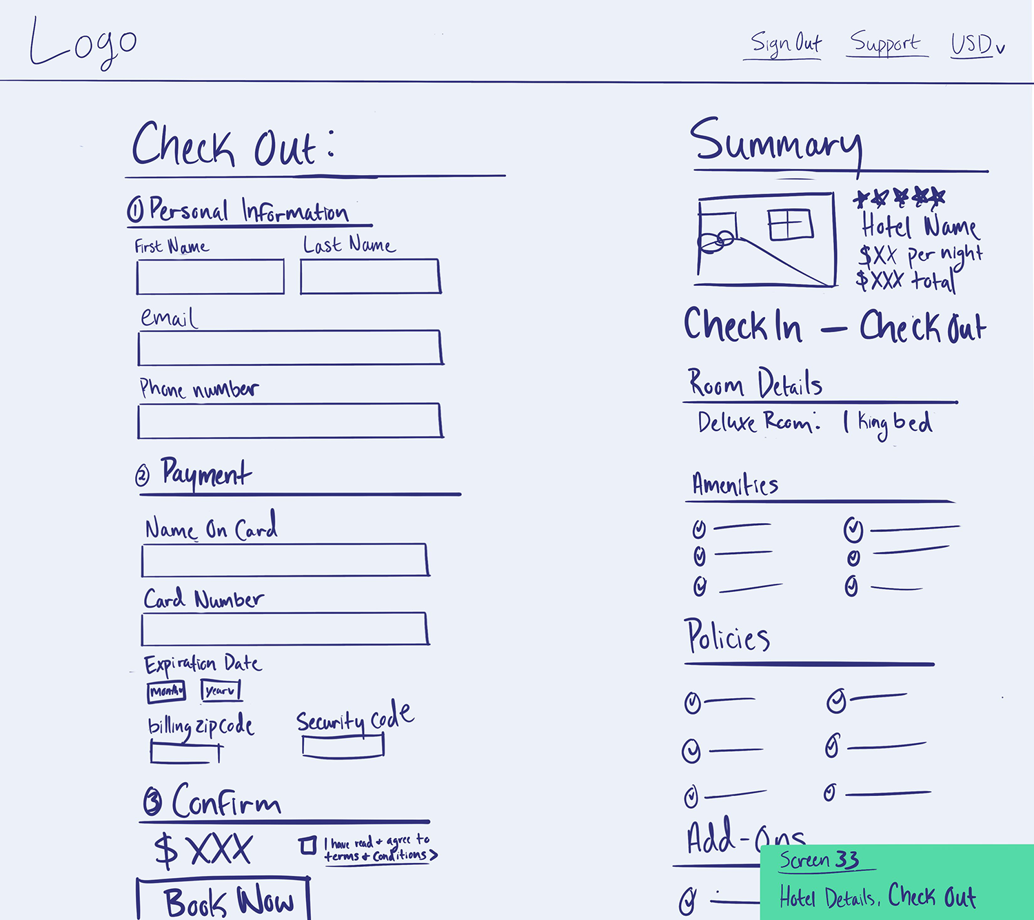
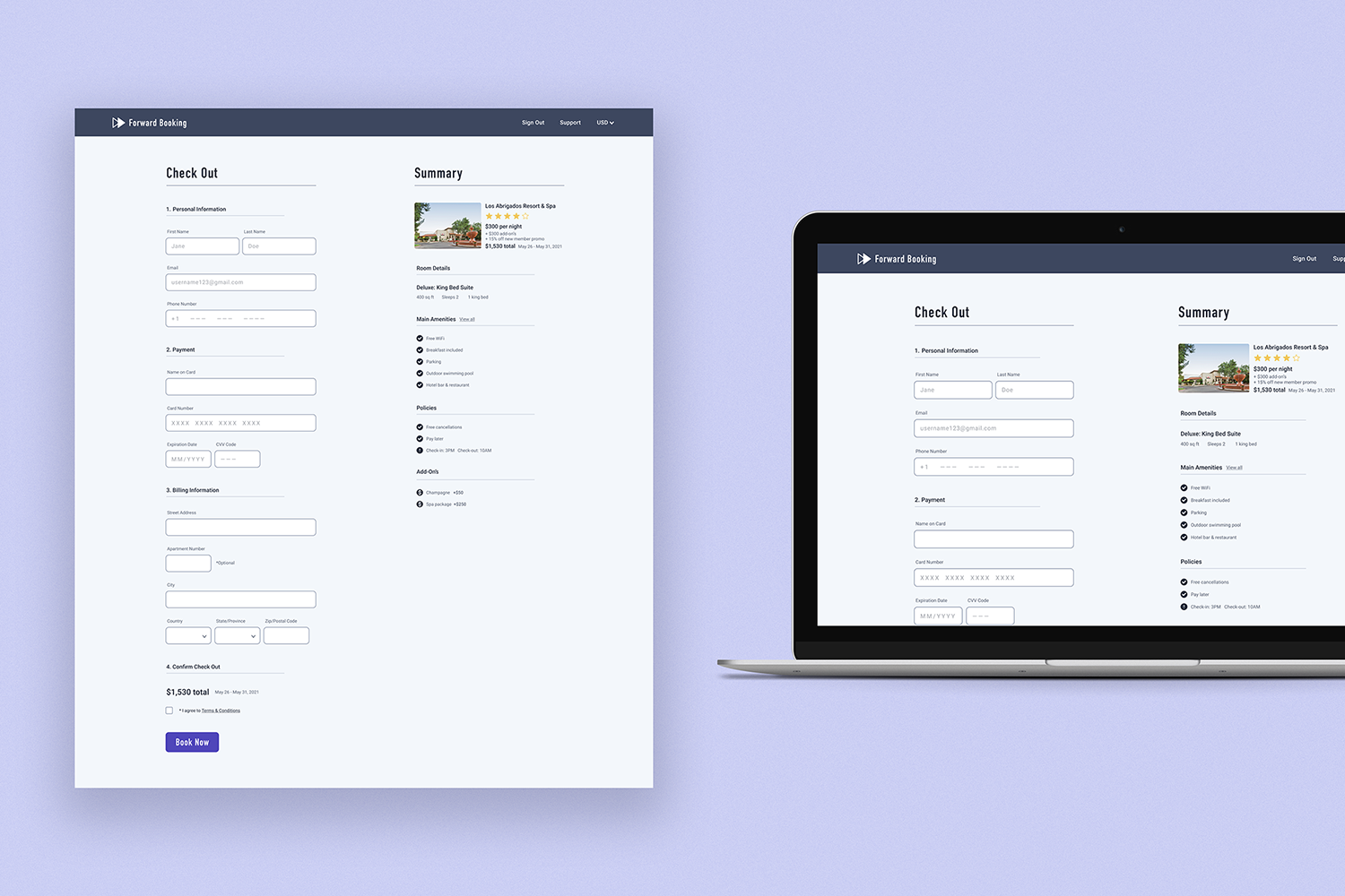
High-fidelity mockups
The intention:
The final step in the UX design process was to build out high-fidelity screens, create detailed notes, and hand them off to the developer team. Here you will see the UI and styling are all finalized and high-resolution imagery is included. These screens here are what the final product should look like after being developed and coded into a fully functional web application.


What I learned
Convenience is key:
Consider adding features in a web application that will speed up the checkout process. Time is precious and a user is not going to enjoy excessively scrolling for important information.
Always value transparency:
Gaining a user’s trust early on in the consumer journey will keep them around much longer. Clearly stating crucial policies and having honest pricing will create a sense of integrity for the brand/application.
Keep it simple and logical:
Folks can quickly feel overwhelmed by cluttered interfaces or wordy descriptions. Rely on basic design principles to create clean and smart layouts– organizing information in a way that is intuitive to users.